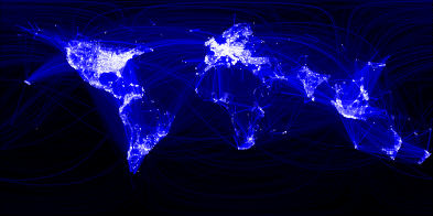
visualizing friendships: facebook
Visualizing data is like photography. Instead of starting with a blank canvas, you manipulate the lens used to present the data from a certain angle.
When the data is the social graph of 500 million people, there are a lot of lenses through which you can view it. One that piqued my curiosity was the locality of friendship. I was interested in seeing how geography and political borders affected where people lived relative to their friends. I wanted a visualization that would show which cities had a lot of friendships between them.
I began by taking a sample of about ten million pairs of friends from Apache Hive, our data warehouse. I combined that data with each user's current city and summed the number of friends between each pair of cities. Then I merged the data with the longitude and latitude of each city.
At that point, I began exploring it in R, an open-source statistics environment. As a sanity check, I plotted points at some of the latitude and longitude coordinates. To my relief, what I saw was roughly an outline of the world. Next I erased the dots and plotted lines between the points. After a few minutes of rendering, a big white blob appeared in the center of the map. Some of the outer edges of the blob vaguely resembled the continents, but it was clear that I had too much data to get interesting results just by drawing lines. I thought that making the lines semi-transparent would do the trick, but I quickly realized that my graphing environment couldn't handle enough shades of color for it to work the way I wanted.
Instead I found a way to simulate the effect I wanted. I defined weights for each pair of cities as a function of the Euclidean distance between them and the number of friends between them. Then I plotted lines between the pairs by weight, so that pairs of cities with the most friendships between them were drawn on top of the others. I used a color ramp from black to blue to white, with each line's color depending on its weight. I also transformed some of the lines to wrap around the image, rather than spanning more than halfway around the world.
via Facebook.
